
Today, I am adding a watercolor technique based card. I have been watching and learning watercolor painting techniques from various Youtube videos. That's how I learned about negative painting technique. Now, I understand the creative process and technique behind paintings that I had seen before and wondered how they brought out an image through negative space coloring. It also reminds me of True Detective series' title sequence.
I am impressed with Linda Kemp's paintings and her videos are really helpful in learning negative painting technique.
I am impressed with Linda Kemp's paintings and her videos are really helpful in learning negative painting technique.
I was itching to create a watercolor painting using this technique. However, before I got a chance to try that my package of a long desired stamp set (Altenew's Persian Motifs) arrived. So, I combined them both and created following cards.


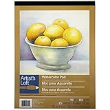
I used 90lb watercolor paper but one can use 140lb paper if they want to. Although watercolors was applied in layers, only first layer was a wash, other layers subsequently required less water and so 90lb paper handled it well. I used following three colors from the bonus pack of Peerless Watercolors - Heliotrope, Robin's Egg blue and Cobalt blue.
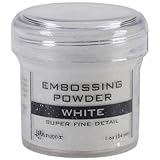
Layer #1: first I stamped and embossed focal images (two big flowers from the set) with white embossing powder. Embossing helped to keep inside of the images untouched while I worked on the outside background. Next, I applied water and dropped the colors randomly to create a light background (outside embossed images). I let that dry completely before getting on to the next step. It is essential to completely dry the paper or colors of the next layer will loose their vibrancy and edges of negative shapes will not come out crisp.
Layer #2: next step is to stamp the images for negative painting. Here, the nature of the technique is shifted from free, loose way of coloring and depicting shapes to focusing around the stamped images. I partially and lightly stamped- flowers (with a magenta watercolor marker) from the same two big stamps. I separately stamped leaves in some spaces using white inkpad. These images were stamped in the background space in a way so that they do not interfere with embossed focal images. I then painted around the stamped images with a color different from the one visible within the image. That created a colorful effect.
 |
| Layer #1: embossing & coloring |
 |
| Layer #2: stamping |
 |
| Layer #2: Coloring around image |
 |
| Completed Layer #2 |
Layer #3: after the paper was completely dry, I repeated this process one more time to create a third layer. Only this time, I used smaller images of the set and deliberately stamped (in white, so they are not very visible) them over and across the negative shaped created in second layer. I believe, because the three colors selected here had blue as a common color, and very small amount of yellow and red in Robin's egg blue and Heliotrope, respectively, that the final colors seem pleasing to the eye.
 |
| Layer #3: Stamping smaller images |

Layer #3: Coloring around images
 |
| Completed Layer #3 |
After this layer was done and dried, I painted the central, embossed images. To keep the contrast I kept them light with more water, less color. The colors in flowers are Heliotrope and a hint of Arbutis Pink (my favorite), and in leaves- Robin's Egg blue. After that dried, I painted these images lightly with pearlescent white color to add shimmer.


Lastly, I added a small strip with sentiment from the same set and attached the panel to the cardbase. I am very happy that it turned out very vibrant and beautiful. I enjoyed the process so much that, I tried to create a video tutorial for the first time. It would have been easier than reading such a long description :). But, it did not turn out well. It is a new adventure for me, and so, I am figuring out how to shoot better and edit videos. Let see...
In the second card, I used combination of Mauve, Robin's Egg blue and Cobalt blue and did not paint over with the pearlescent color.


Final view,

Enjoy!
Submitted to:
Items used:


4 comments:
I just love your cards, the technique you used is fabulous and I think you've done a wonderful job. They are sooooo pretty and love you colours, well done
This is a gorgeous card! The colors are so lovely. Thanks for sharing the steps you used to make it. I keep finding myself drawn to watercolors more and more. Thanks for joining us at Simon Says Stamp Monday challenge!
Thank you Robyn for complements and encouragement!
Thanks Maura!
Post a Comment